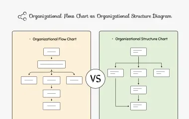
Org Chart
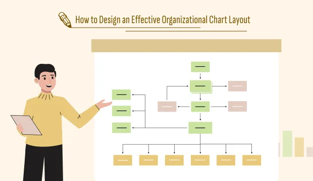
How to Design an Effective Organizational Chart Layout


Get your team started in minutes
Sign up with your work email for seamless collaboration.
An organizational chart is not just a snapshot of the company, but a visual representation of the whole structure of your team. If it is well-designed, it reveals the ways how decisions flow, how teams are interlinked, and how responsibilities are spread across the organization. On the other hand, a badly designed chart can have the opposite effect - creating confusion instead of clarity.
A strong layout indeed differentiates whether you are creating your first org chart or updating it for a growing business. The key principles of organizational chart layout design, making the right structure choice, and how Cloudairy's visual templates make the process easy are all things this guide will help you with.
The layout of your org chart determines how clearly it communicates hierarchy and collaboration. It’s not just about who reports to whom — it’s about how information moves and how work gets done.
An effective layout:
Without a thoughtful layout, even the most accurate org chart can become messy, overwhelming, or misunderstood.
Prior to using a design tool, it is essential to have a clear understanding of your organizational structure. To this end, consider the following questions:
The kind of layout you need will be determined by your responses. As an example, a large corporate structure may be the one to opt for a hierarchical layout while a creative startup may be the one to go for a flat layout in order to gain better collaboration.
In case of having doubts on which structure applies, Cloudairy's Org Chart Design Tool allows you to visualize and experiment with each option interactively.
Your layout choice plays a major role in determining the perception of your organization. The following are the most common options with explanations as to when they are best suited:
This traditional model displays a pyramid-like structure with the C-suite at the top, the managers in the middle, and the team members at the bottom. It is very clear and the right choice for organizations that support authority and organization.
Best for: Large companies, government institutions, or universities.
A wide-open and horizontal structure with not so many layers of management. It’s quick, flexible, and the perfect fit for companies that allow their employees to be creative and treat them equally.
Best for: New companies, small scale businesses, and teams working with a great deal of flexibility.
The workers under this arrangement will have more than one boss usually a functional and a project manager. It is a solution for companies that are constantly managing several projects at the same time.
Best for: Creative design firms, R&D units, and software developers.
This system divides employees into different sections based on their functions and capabilities for example, marketing, finance, and HR. The company will not only have specialists but also a good understanding of each other.
Ideal for: Medium-sized organizations and business service companies.
You can test these different formats using the Organizational Chart Layout Template from Cloudairy, which has pre-designed configurations for hierarchical, flat, and matrix models
Once your structure is clear, focus on the visual design. The goal is to make your chart intuitive and easy to read.
Modern org charts go beyond static boxes. Add interactive elements that bring your structure to life.
For example:
Cloudairy’s Org Chart Design Template allows you to do all of this directly — turning your chart into a living workspace rather than a static document.
Once your chart is drafted, share it with department heads or team leaders for feedback. Their input helps ensure that reporting relationships and team structures are accurate.
Ask questions like:
Collaboration ensures accuracy — and Cloudairy’s built-in commenting and real-time co-editing features make that process smooth and transparent.
A chart that is properly designed but not updated becomes useless. You should regularly review your org chart at least once every three months or every time when there is a change in structure in your company.
With Cloudairy, making changes is very easy — you can do it instantly moving, adding or editing nodes without the need of rebuilding the whole layout.
Even experienced teams make design errors. Here are a few to watch out for:
Avoiding these pitfalls keeps your chart clean, modern, and functional.
The best organizational chart layout is the one that provides a clear structure and has a nice design. If it is done correctly, it will turn into a map assisting communication and collaboration.
A simple diagram can be transformed into a strategic management tool if you use a good layout together with visual best practices.
If you want to make one yourself, you can either begin with Cloudairy’s Organizational Chart Layout Template or instantly customize layouts with the Org Chart Design Tool. You can also look at the Org Chart Design Template for examples that can be edited and that show different styles to get your inspiration.
Think smarter, see clearer Sign up for Cloudairy Free and give it a shot.
Start using Cloudairy to design diagrams, documents, and workflows instantly. Harness AI to brainstorm, plan, and build—all in one platform.
Table of Contents

Introduction
 Manage all your work in one placeCollaborate with your teamUse Cloudairy for FREE—forever


 (1).webp)
 (1).webp)