hero-bg-pricing

Get your team started in minutes

Sign up with your work email for seamless collaboration.

High-Level System Architecture
Technical Diagramming

How to Design a High-Level System Architecture Diagram

Author
Chandresh
By Cloudairy Team
January 10, 2026
10 min read

A system architecture diagram at high level is a general, high-level plan of a software system that by design leaves out implementation detail. System architecture diagram defines the overall scope, major building blocks, and how they fit together. Unlike lower-level technical images, who uses the system, what core applications are involved, where data resides, and which outside services the system relies on are highlighted. This artifact grounds discovery, governance, and roadmapping planning.
If you want to skip ahead and design your own, try the High-Level Architecture Diagram Template in Cloudchart.

What Is a High-Level System Architecture Diagram?

A high-level architecture diagram is a very broad high-level blueprint or conceptualization of a software system that deliberately leaves out implementation details. It builds the frame for the overall scope, names major building blocks, and puts down clarifications about the relationships among the blocks. Unlike low-level technical views whose focus is mainly on interactions between parts of the system, the emphasis here is on who the parties are that interact with the system, what core applications participate in the interactions with each other, where data live, and which external services the system depends on. This artifact anchors discovery, governance, and roadmap planning.

  • The users and external actors that interact with it. Describe primary personas (customers, employees, partners) and third-party systems initiating or receiving interactions. Keep labels short (e.g., “Customer,” “Payment Gateway”) and avoid role duplication.
  • The major systems and applications involved. Capture web, mobile, APIs, batch services, and admin consoles. Focus on “what it is” and “why it exists,” not technology choices. Group related apps to minimize clutter.
  • Data stores and integration that underpin it. Remember web, mobile, APIs, batch services, and admin consoles. Focus on the "what it is" and "why it is there" rather than technology decisions. Bunch up connected apps to prevent clutter.
  • Unlike detailed system diagrams, it avoids implementation detail and focuses on scope, boundaries, and relationships. Resist drawing classes, tables, ports, or protocol minutiae. The goal is shared understanding, not code-level accuracy.
    Compare this with other types in our blog Types of Architecture Diagrams Explained.

Why Start at the High Level Before Going Into Detail

Drawing a high-level architecture before starting work ensures that the entire team operates on a shared foundation. It helps define the problem space and therefore narrows down the scope and lays expectations about interfaces and responsibilities. The earlier a big-picture agreement can be hashed out, the less likely it is the teams will later have to rehash inconsistencies when trying to produce C4 or UML diagrams for the implementation detail.

  • Executives understand the system scope. A high-level picture conveys the outcomes in jargon-free terms: who the system serves, what capabilities it has, and how value flows across the channels. It supports portfolio prioritization and risk assessment by making it easier to approve funding and align with the business strategy before getting into the architectural engineering.
  • Product managers see what’s included vs excluded. This view is used by project managers to confirm scope boundaries, dependencies, and sequencing across milestones. Early emphasis on external systems and regulatory concerns facilitates trades against the roadmap and realistic delivery planning, thus cheaper reworking later.
  • Engineers get alignment before coding. Engineers gain clarity on system boundaries, upstream/downstream dependencies, and integration constraints. This reduces ambiguity during design reviews, improves estimation, and prevents divergent assumptions that often surface late during implementation or testing.

Think of it as the “north star” that guides more detailed diagrams.

Key Components of a High-Level Diagram

Whenever I teach someone how to design a high-level architecture diagram, I emphasize using consistent icons and meaningful names that make sense to your own team. Avoid going too deep into technical details it is something I had to learn early in my career. The big focus should always stay on people, main systems, storage layers, and any outside systems you depend on. I like arranging everything simply, grouping related boxes, and adding arrows or labels that clearly explain the flow. This way, even somebody seeing it for the first time can understand the big picture in about a minute. Keep the tone straightforward and describe purpose, not the inner workings that is what your technical documentation is for.

  • Users & Actors

    I tell my trainees to start by listing who uses or connects to the system and for what reason. Think of customers, coworkers, admins, vendors, and system bots they all play specific roles. Do not forget to include third-party tools, like your payment or login systems, that interact externally. If possible, keep the number of actors short and merge user types that serve the same purpose it makes everything clearer. The main goal is to show who starts system actions and where responsibilities are handed off, something I always remind my students during diagram reviews.
  • Core Systems & Applications

    outline the key systems at the center of the solution: webapp, mobileapp, backendapis, adminportal, batchprocessors, and gateways. For each, select a brief tag outlining purpose (e.g., “Checkout API”). Order them by layer (UI, application, data) or by domain to keep across-line jumping low. In general, refrain from proxying internal modules at this level; focus on services that control abilities.
  • Data Stores & Integrations

    Reveal the key operational database(s), caches, message brokers, analytics stores, and key third-party APIs. Depict ownership and read/write direction via brief, regular arrows. Do not include schema information; a brief name like “Orders DB (OLTP)” or “Warehouse (OLAP)” suffices. Position stores close to their owning systems so data responsibilities and integration points are doctrinally clear.
  • External Dependencies

    Note down all the main external providers our architecture connects with payment systems, CRM tools, marketing automation setups, observability services, IDaaS, and external compliance or tax services. Highlight only the top-priority vendors rather than every single one. Define trust limitations clearly and label “managed externally” to communicate control and SLA attention. Doing this helps all of us grasp vendor risks, ensure better security, and manage external contracts efficiently.

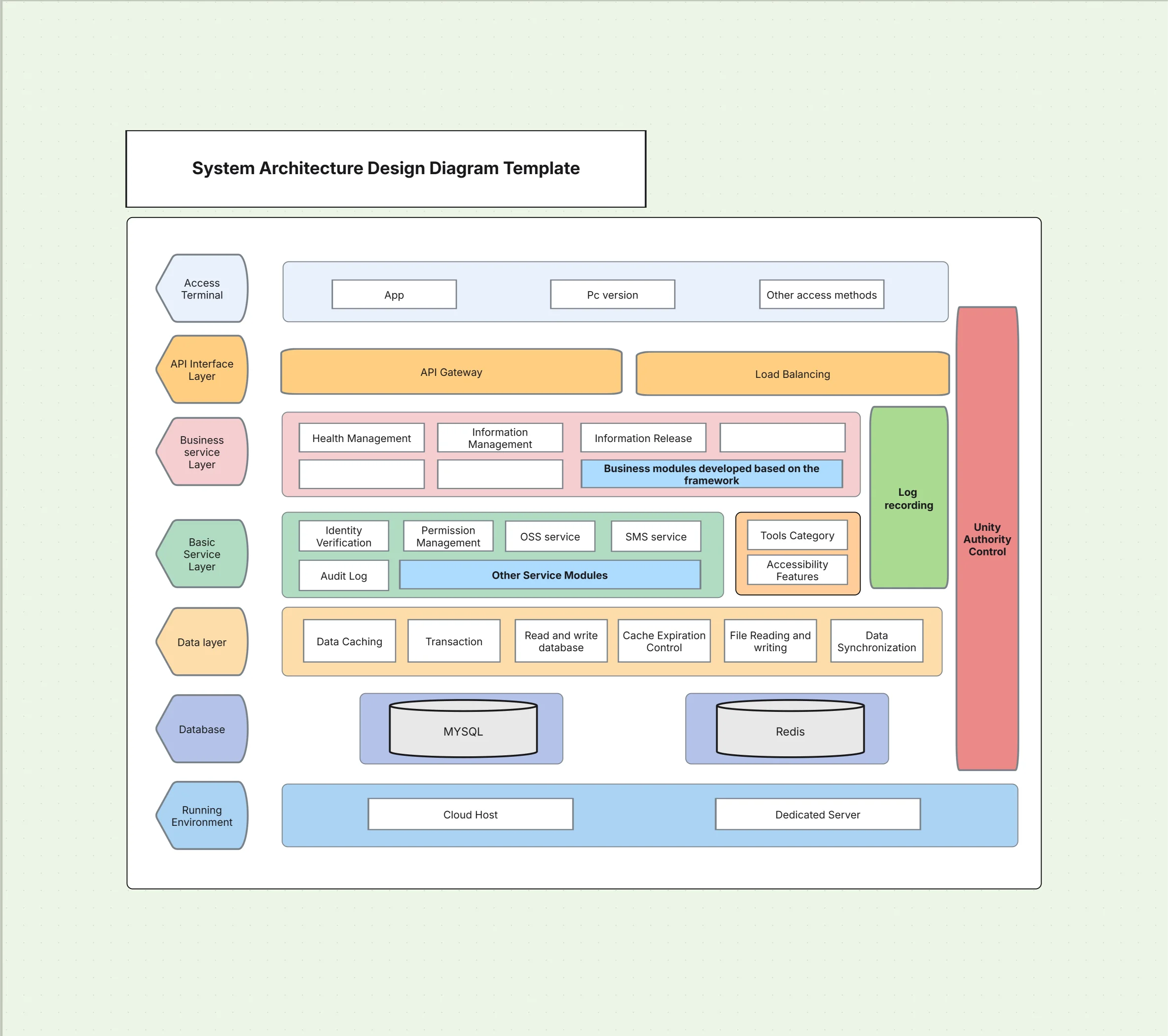
You can easily refer to the System Architecture Design Diagram Template to kick things off efficiently.

System Architecture Design Diagram Template

How to Group and Organize the Diagram (Layers & Domains)

  • Grouping: really helps reduce the mental or cognitive load and makes your high-level architecture diagram much more scannable for everyone. Try to choose a clear organizing principle that fits your style and apply it consistently whether that is layers, domains, or boundaries. Use neat containers like boxes to group related components together and leave enough white space to naturally separate concerns. Eliminatenesting nesting things too deeply; honestly, two levels are usually plenty. Ultimately, to improve the user is overall experience, work on keeping visual noise to a minimum. Select short and precise labels for group sections, and avoid adding too many links that jump across different group boundaries.
  • By layer: UI, application, data, infrastructure. This classic approach supports clean separation of concerns. UI shows channels, application shows services and gateways, data shows operational/analytics stores, and infrastructure shows shared components like queues or CDN. It’s ideal for onboarding and governance because responsibilities are instantly clear and stable over time.
  • By domain: sales, finance, customer service. Domain grouping aligns architecture with business capabilities. It clarifies ownership, highlights cross-domain dependencies, and supports scaling teams separately. Use this where domain-driven design is practiced and when roadmaps are organized by capability rather than layers.
  • By boundary: internal vs external systems. Boundary grouping emphasizes trust zones and contract surfaces. It’s useful for security reviews, vendor risk, and compliance audits. Draw a clear line for “managed externally” and “managed internally,” then show integration paths that traverse the boundary through gateways or APIs.

This is similar to a Layered Architecture Diagram, but kept at the big-picture level.

Mapping Flows and Dependencies Clearly

From my recent projects, I have learned to focus only on the primary flows that make a difference user interactions, main read/write processes, and any highly important third-party connections. My personal rule is to use directional arrows with short action words like “place order,” “charge card,” or “sync profile,” and skip protocol-level detail here. I take extra care to apply uniform line styles for synchronous versus nonsynchronous communication, while keeping every edge straight to maintain visual clarity.Reserve sequence or activity medications for deeper UML or C4 component diagrams.
For more detailed flows, you can use the UML Software Diagram Template.

  • User → Web app → Database. Show the primary request path and the ownership boundary. If caching or a queue sits in the middle, indicate it only if it’s essential to understanding reliability or performance.
  • CRM → Data warehouse → BI tool. Depict ETL/ELT as a single directional flow. Avoid listing every pipeline step; annotate the objective (e.g., “daily sales analytics”) to explain why the integration exists.

Adding Non-Functional Overlays (Security, Reliability, Performance)

When I create non-functional overlays, I make sure the high-level architecture diagram clearly communicates risk and quality attributes without overwhelming people with excess detail. I prefer to add subtle annotations or slightly shaded regions to identify security boundaries, planned availability strategies, and performance tweaks. Overlays should stay focused on the most important ideas for your viewer, while offering links to deeper documentation for anyone who needs a closer look. This approach keeps the diagram pleasant to read while also showing the system’s operational posture and practical constraints across environments.

  • For designing security zones (internal vs external): I usually outline a clear perimeter for public, partner, and internal networks. It is helpful to label identity providers, secrets management components, and data classification areas (PII, PCI) at a meaningful overview level. Avoid going into cipher suite details or IAM policy fine points right here.
  • High availability (multi-AZ, replication): Note regional distribution, active-active vs active-passive, and key replication points (DB, cache, queue). Indicate failover domains without drawing every node.
  • Performance (CDN, caching layers): Show CDN in front of web channels and caches near heavy read paths. When you know a queue is helping smooth out bursty traffic, mark it with a short note such as “buffer writes during heavy load.”

For instance, in a Hybrid Cloud Architecture Template, make sure you sketch a distinct dividing line between the local on‑prem systems and the cloud parts so viewers immediately see the separation.Step-By-Step

Process to Create a High-Level System Architecture Diagram

Making a high-level architecture diagram is like drawing a map for your system.Use a simple, repeatable way so everyone’s work looks and feels the same. Begin with knowing your goal, then gather the main bits and arrange them carefully. Share it with your team, make changes together, and note down all the decisions. Keep the diagram in the same folder as your product’s notes and documents. Treat this diagram like something alive it will grow as the system grows and will help you build all the smaller, more detailed models later.

  • Define the purpose and audience (execs, engineers, auditors): Write a one-sentence objective and list primary readers. Decide which overlays (security, reliability) matter for them. Your audience choice determines grouping, labels, and how many flows you include.
  • List the key systems and actors: Inventory channels (web, mobile), core services, data stores, and external providers. Keep names stable and descriptive. Remove anything not essential to the story at this level.
  • Group them neatly into logical layers or domains: that suit your design sense. Pick one clear grouping approach and stick with it consistently. Use generous white space and visual containers to cut down on unnecessary clutter. Limit nesting carefully to two levels to keep your diagram readable and human-friendly.
  • Map the main interactions: that genuinely impact your process. Add directional arrows only where the main flows are essential. Label them with short, specific verbs and clear results. Let’s push aside those small, tricky edge cases for now and handle the complex error paths later when drafting detailed sequence diagrams.
  • When adding non-functional requirements: make sure each annotation speaks directly to your team’s specific security concerns, HA settings, and areas likely to face the most load. Link anthologies out to your official resources instead of cluttering the diagram with too much detail.
  • Present the diagram to executives: PMs, and engineering staff for careful review. Discuss and lock down the scope, clarify boundaries, and record dependences. Make final decisions within the document itself to assure they're tracked.
  • For version control, document each review: include the date of changes, and store your files securely in Git or whichever system your team relies on. Update the diagram systematically when major releases occur.

Download our exclusive hands-on guide to Designing Architecture Diagrams today to get a simple step-by-step process.

Real-World Examples of High-Level System Architecture

In a generic way, high-level diagrams provide a quick alignment of people across level and industries. They become useful in situations of RFPs, due diligence, security review, incidents postmortems, and product onboarding. The next slides will take you through some examples of a concise system architecture diagram to communicate scope, dependencies, and risk without going into cumbersome detail, thus enabling faster decision-making and cleaner handoffs towards engineering for deeper design work.

  • E-commerce platform. Shows customers, web app, checkout API, payment gateway, order database, and analytics sink. Highlights PCI boundary and asynchronous order confirmation via queue for resilience.
  • Banking system. Includes mobile applications, core banking, fraud detection, reporting, and secure data zones. Emphasizes trust boundaries, audit trails, and high availability across regions.
  • AI-based SaaS product. Depicts user interfaces, ML inference API, feature store, vector database, and cloud provider services. Notes latency constraints and data governance for PII.
    Want to visualize AI systems? Try the RAG Architecture Diagram Template.

Best Practices for High-Level Diagrams

High-level architecture diagrams should be fast to read and easy to maintain. Favor clarity over completeness, name things consistently, and keep connections simple. Include a legend if you use special line styles or overlays. Finally, treat the diagram as living documentation by versioning it and pruning it aggressively as the system evolves.

  • Keep it simple—3 to 7 main components. Too many boxes kill readability. Merge related items under a group and link to detailed diagrams for depth.
  • Use consistent icons and shapes. Consistency speeds comprehension. Pick a small icon set and stick to it across teams.
  • Avoid deep technical detail. Save ports, schemas, and retry logic for C4 components or UML sequences.
  • Always label flows clearly. Use concise verbs and avoid acronyms when possible. Readers should understand flows without a legend.
  • Version diagrams as the system evolves. Date-stamp and store source alongside code or docs. Add change notes for major shifts.
    For a comparison of styles, read our blog Clean Architecture vs Layered Architecture in Modern Software.

Tools and Templates to Build High-Level Architecture Diagrams Faster

The right tools reduce friction and keep your system architecture design consistent. Templates help teams start from proven layouts, while AI assistance speeds iteration and keeps labels uniform. Collaboration and version history prevent drift across squads and environments. Prioritize exports your stakeholders actually use (PDF for execs, SVG/PNG for wikis) and keep a single source of truth synced with your documentation.

Templates to Start With

Templates accelerate alignment by giving you structure, icon choices, and layout heuristics that already work. Use them as a baseline you can adapt to your domain and compliance needs. Each template below pairs well with deeper C4 or UML models to add detail later without redrawing the big picture.

  • High-Level Architecture Diagram Template. A clean canvas with actor lanes, core systems, and data zones pre-grouped by layer. Includes legend, flow styles, and security boundary placeholders so teams can annotate quickly during discovery.
  • System Architecture Design Diagram Template. A versatile layout for product teams that need to show channels, services, data stores, and key third-party dependencies in one view. Optimized spacing keeps cross-domain lines readable.
  • Enterprise Architecture Diagram Template. Designed for portfolios spanning multiple domains. Emphasizes capability grouping, shared platforms, and external vendor surfaces to support governance and investment reviews.

Why Use Cloudchart?

Generic drawing tools make consistency hard and slow teams down. Cloudchart’s Architecture Diagram Maker standardizes patterns and accelerates creation, while keeping your system architecture diagram readable across audiences.

  • 500+ templates and stencils. Start from proven layouts for high-level architecture diagrams, C4, UML, and security overlays. Curated icon sets reduce noise and keep visual language consistent across teams and documents.
  • AI-assisted diagram generation. Generate a first draft from a prompt, then refine structure and labels interactively. The AI keeps naming consistent and suggests groupings that match your chosen layering or domain model.
  • Team collaboration and version history. Comment, branch, and review in real time. Track changes across releases and roll back if needed, ensuring your diagram remains the single source of truth.
  • Export to PDF/PNG/SVG. Share crisp exports for exec briefings, wikis, and audits. Keep vector assets in repos so diffs and updates stay lightweight and maintainable.
    For tool comparisons, see our blog Best Tools to Create Architecture Diagrams.

Conclusion: Start Big, Then Go Deeper

High-level system architecture diagrams are the foundation for discovery, alignment, and governance. They clarify scope, expose dependencies early, and give every stakeholder a shared language before implementation begins. Start with users, core systems, data stores, and external dependencies; group by layers or domains; and add only the non-functional overlays that matter. Then link to deeper C4 or UML views as the design evolves. This approach keeps your system architecture diagram clear, consistent, and truly useful across the project lifecycle.
Use the High-Level Architecture Diagram Template in Cloudchart to get started today.

Use Cloudairy template to streamline complex cloud tasks with simple, ready-made functions.

FAQs for (High-Level System Architecture Diagram)

1.What should a high-level system architecture diagram include?

Actors, core systems, data stores, and external dependencies, plus a few labeled flows. Keep it technology-agnostic and reserve details for deeper C4/UML models.

2. How is a high-level architecture diagram different from C4 or UML?

It frames scope and relationships without deep implementation detail. C4 and UML add precision later (containers, components, sequences, classes).

3. How many components should I show at the high level?

Aim for three to seven. Merge related items into groups and link to detailed diagrams rather than cramming everything into one view.

4. Should I show security, reliability, and performance?

Yes lightly. Use overlays for zones, availability patterns, and caching/CDN. Keep specifics (IAM policies, failover scripts) in linked docs.

5. What tools are best for high-level diagrams?

Use Cloudchart for ready-made templates, AI generation, collaboration, and clean exports. It keeps your system design diagram consistent across teams.

Ready to create smarter with AI?

Start using Cloudairy to design diagrams, documents, and workflows instantly. Harness AI to brainstorm, plan, and build—all in one platform.

Recommended for you
Using Flow Diagrams in Agile Teams
Technical Diagramming